Pinterest Onboarding
Design challenge submission for SeatGeek’s 2022 New Grad Product Design opportunity.
role
Individual Project
tools
Figma, Zoom
focus areas
UI/UX, Research, Prototyping
↓
scroll down to learn more!
CHALLENGE
Choose an app that you admire and share how you think it can be improved.
SOLUTION
Redesign the mobile iOS version of Pinterest's onboarding process to provide a clearer, more inspiring experience for users.
HIGH FIDELITY SOLUTION
If you’d simply like to take a look at my high-fidelity screens, check out my Figma file (or watch the GIF) below!
….but if you wanna read about my process, and how I got to that design solution in the first place, scroll on to keep reading! 😎
BACKGROUND
My personal experiences with Pinterest have always been positive ones, so I was naturally drawn to the app for this design challenge. Since 2015, I've enjoyed using Pinterest to find inspiration in a variety of things, from fashion tips👗 to embroidery designs🧵 to homemade card ideas💌. Above all, Pinterest has become like my secondary Google search! What hairstyles look good for my face shape? What are some cool examples of isometric design? The visual emphasis of Pinterest's feeds and boards are what I love most and find most helpful.
Pinterest was as easy to me as the back of my hand, but I'd been a user for years. I wondered how Pinterest currently introduced itself in the onboarding process to new users.
UNDERSTANDING CONTEXT
What is Pinterest?
Before beginning with anything else, I started off by researching Pinterest as a company in order to better understand the their mission and how their platform works.
With over 440 million monthly users, Pinterest's goal is to build out the world's first visual discovery engine and “bring everyone the inspiration to create a life they love" (source). Users can browse and search the app for ideas, and save ("pin") those ideas for later use if needed. Pinterest divides the mission of their business and employees into 5 core values:
Understanding Pinterest's mission helped me prioritize what its users should feel when experiencing the app. This is especially so for an app onboarding process, which serves to introduce new users to a platform and showcase its features to increase the likelihood of adoption.
It had been so long since I'd onboarded onto Pinterest myself that I was curious how the current onboarding process served this role and upheld Pinterest's core values.
RESEARCH
To empathize with new Pinterest users and understand their onboarding process, I conducted 2 types of research:
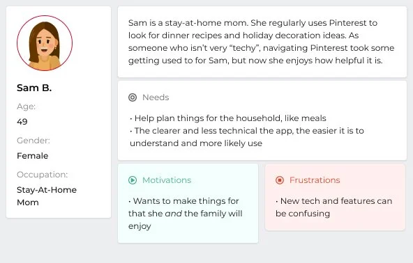
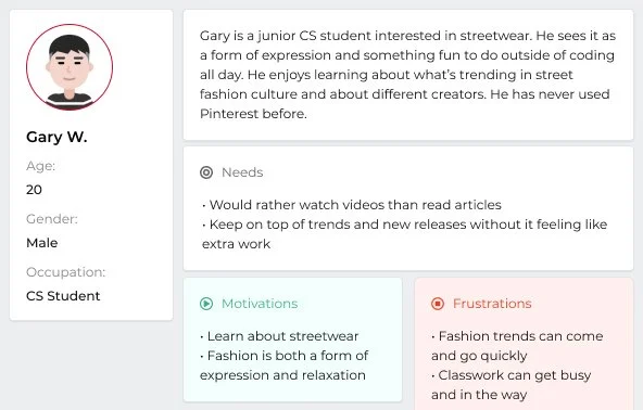
1. User and non-user research
I reached out to Pinterest users and non-users to learn about their values and what they'd be looking for on the platform.

Persona 1
Persona 2
Persona 3
Through my user interviews, I was able to frame three “How Might We” questions to further my research exploration:
How might Pinterest’s onboarding experience clearly explain what the app is and how it relates to a user’s individual interests?
How might the onboarding assure users that the platform solves their interest-related problems and will be worth their time?
How might the onboarding be both simple in presentation yet thoroughly informative, to minimize confusion and save time relearning later down the road?
2. Product research
I, along with my interviewees, made new Pinterest accounts to figure out first-hand what the current onboarding process was like. After we'd onboarded onto the platform, I reinterviewed them and compiled all of our impressions of the experience:
Screen recording of the current onboarding process for new users
User journey chart of the current onboarding process for new users
↳ Product Insights
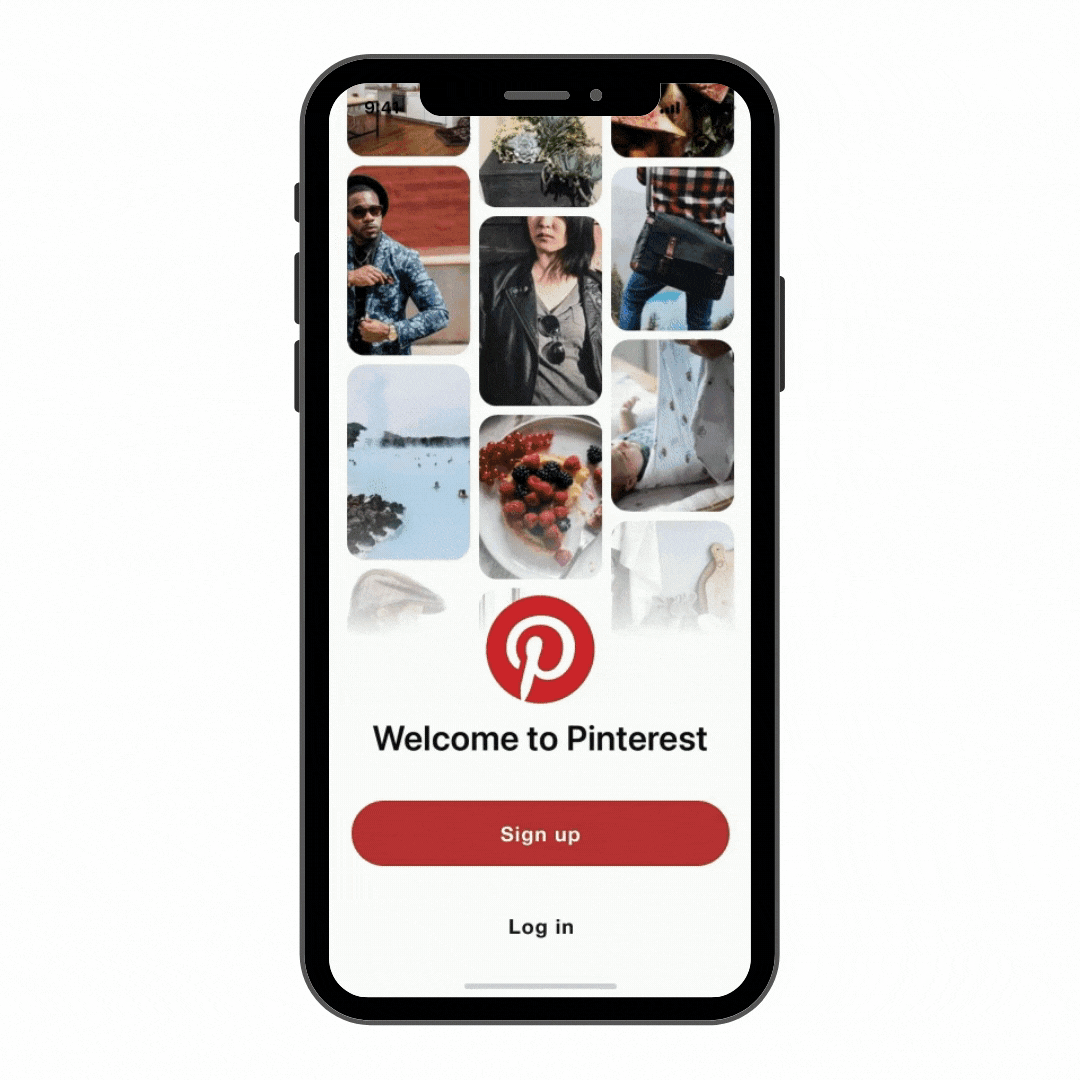
Impression #1:
Unlike Pinterest's website and web homepage, the mobile onboarding fails to explain what Pinterest even is; it spends too much time asking for personal details and too little time making sure new users know what they're getting themselves into.
Pinterest's website makes it clear to new users what they’re all about.
Mobile app fails to explain what Pinterest is.
Impression #2:
Because the onboarding fails to explain what Pinterest is and how it works, it fails to help new users understand what value they can get out of Pinterest if they continue to use the app. Minimalism ≠ Clarity!
Impression #3:
None of Pinterest's core values shown through in the onboarding, which makes it more difficult for a new user to feel connected and understood by the app they are signing up for.
IDEATION
Redesign opportunities
After finishing my research, I evaluated my data to define 3 redesign opportunities that I wanted to address in the new onboarding process:
Lack of clarity about what Pinterest is and why users would want to use it
Confusion about the connection between interests and pins/ideas
No presence of core values, or the feeling that Pinterest wants to benefit its users
User journey
I usually begin my redesigns by physically sketching out my ideas.
I think it's important to be able to see the big picture, and putting pen to paper is a great way to do that!
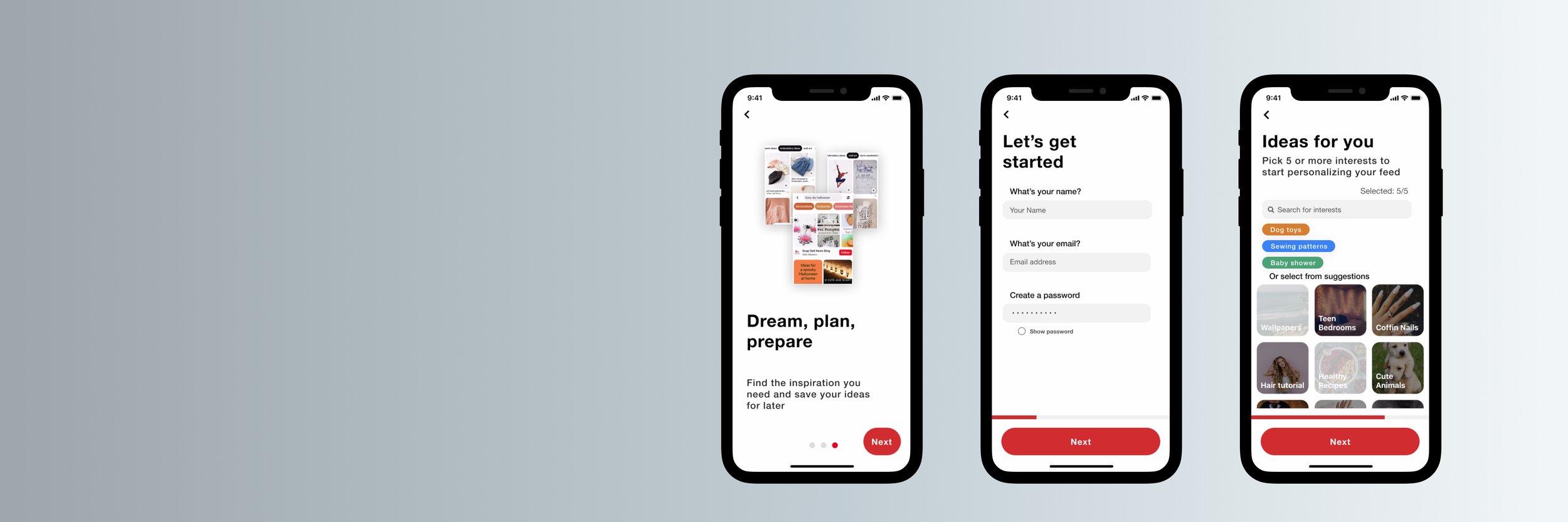
FINAL DESIGN
Major redesigns
↳ Information screens
When the user opens the app for the first time and taps the "Sign up" button, they will immediately be taken to a 3-screen explanation of what Pinterest is and why it would be useful to use. This tackles all 3 redesign opportunities!
↳ Selecting interests
One of the main issues with the original onboarding process is how it fails to explain why the user needs to select ideas. It also limits the initial personalization of the new user's feed by offering a select number of suggestions -- many of which may not interest the new user in the slightest.
I redesigned the onboarding Selection of Interests to offer a search bar so that new users can directly add their unique interests. I also clarified the explanation copy to make the purpose of this task more apparent to the user.
↳ Progress bar + buttons
I redesigned the progress bar to run along the bottom content and consistently show the user's onboarding progress. I also reformatted the buttons to maintain the same shape, size, and color. This was an improvement from the original assets, which would look different on or disappear from almost every onboarding screen.
CONCLUSION
Hey SeatGeek, this was so much!! I really enjoyed learning more about Pinterest, and figuring out a way to help new users understand an app I adore. Here are a few insights I gathered from participating in this design challenge:
❤️ At the heart of any design project is the user
Design challenges aren’t just a test of hard skills! They’re for learning about and solving a problem for real users. There is no use getting caught up in the aesthetics and presentation of a design if it doesn't end up benefiting the person you're designing for! :)
💡 Understanding the mission of a brand is important to their design
Learning more about Pinterest and their commitment to inspire users was incredibly helpful to me as I envisioned the value they might want to convey to users during an onboarding process. This part of the design challenge helped me realize that creating positive experiences for users starts with a brand's (and more specifically, a brand’s employee’s) commitment to make that happen.
Dear SeatGeek: thank you for reading to the end, and thanks for the fun design challenge!!
I hope to chat with you soon! :D