Handshake Redesign
Design challenge submission for the Kleiner Perkins 2022 Fellowship
role
Individual Project
timeline
December 2021 (1 week)
focus areas
User Experience + User Interface Design
tools
Figma + Figjam
OPPORTUNITY
CHALLENGE
Redesign a feature on Handshake to provide a better job-hunt experience for college students.
Redesign a feature from any of the companies participating in the Fellows Program
BACKGROUND
Let’s face it: looking for jobs can be tough.
Handshake is just one of many job hunt platforms out there, with a mission to ensure that all college students have equal access to meaningful careers. As my university’s recommended recruiting and job posting platform, I’ve used Handshake in the past to apply to internships and on-campus jobs. However, it isn’t my go-to resource; in my experience, the platform could be both overwhelming and underwhelming at once, with too much information in some sections and too little information in others.
I was curious to discover what other students’ experiences with Handshake were like, and how they felt about the platform.
RESEARCH
Interviews
In order to learn more about the Handshake experience and identify specific user needs and pain points, I interviewed four college students.
Two of these students were underclassmen that were new to job hunting in general, while the other two were upperclassmen who were familiar with and had experience in job hunting processes.
Questions revolved around:
Past job hunting experiences, with or without the use of Handshake
Motivations and decisions made when it comes to finding the right job
Pain points of the job hunting experience and of Handshake
Usability tests
I conducted usability tests to get a better understanding of how a college student might use the Handshake platform. I presented two user tasks:
Navigating how to search, locate, and apply to a job
Navigating how to learn more about a specific role or company
Competitive research
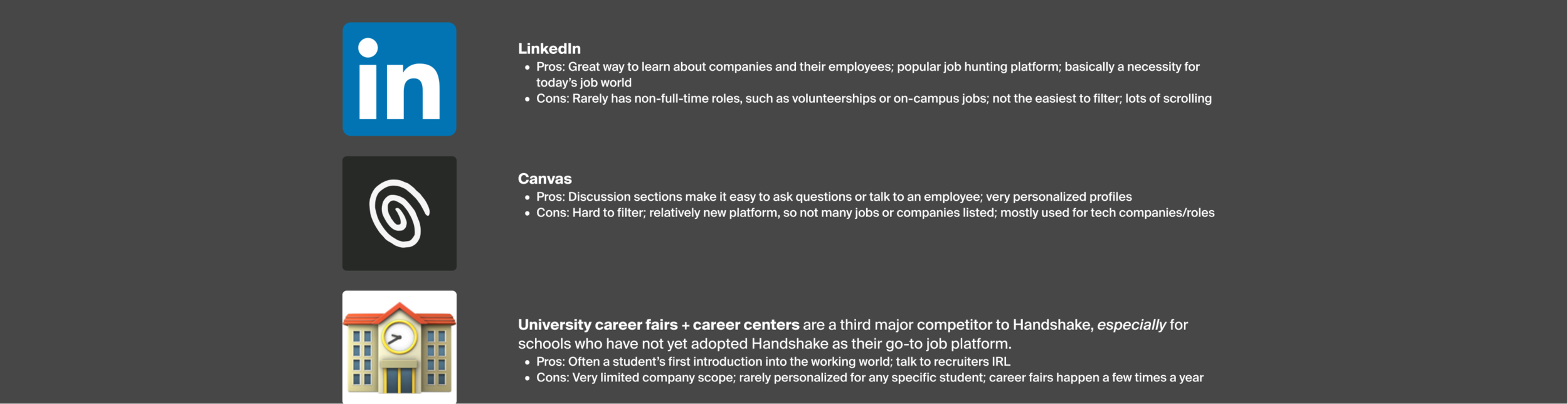
Handshake has features similar to its competitors, such as a user profile, company profile, and job listings page. However, its positioning as a helpful, student-centric platform is what makes it stand out to that of its competitors, and lead to adoption by universities and colleges nationwide.
INSIGHTS
About students
1) College students value meaningful work and company reputation.
Career-building doesn’t start after you’ve started a new role ⸺ it begins way earlier during the recruitment process. Before entering a role, students want to know if they’ll be pursuing a fulfilling, engaging experience.
2) Students value opportunities to learn from a company’s employees.
While not every interviewee was familiar with networking techniques, every interviewee did speak positively about being able to talk to employees in real-time. By gaining as much knowledge about a role before the real-deal, students feel relief; they feel they are avoiding potential career mistakes.
About Handshake
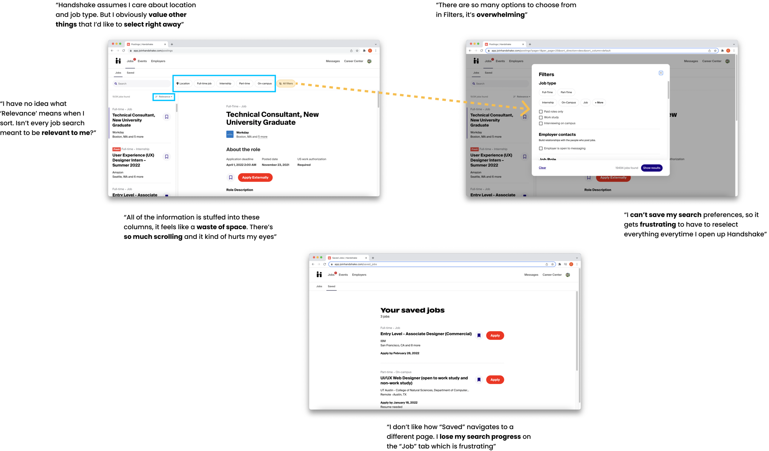
1) Students feel a disconnect on the Jobs page between what they want and how to find what they want
Limited sorting and filtering default options
All filters is too extensive for one module
Saved navigates to a new page, which is unhelpful when trying to compare past saves to roles you are thinking about
Inability to review past searches makes job hunting feel more tedious and repetitive
2) Students feel let down by the job application process
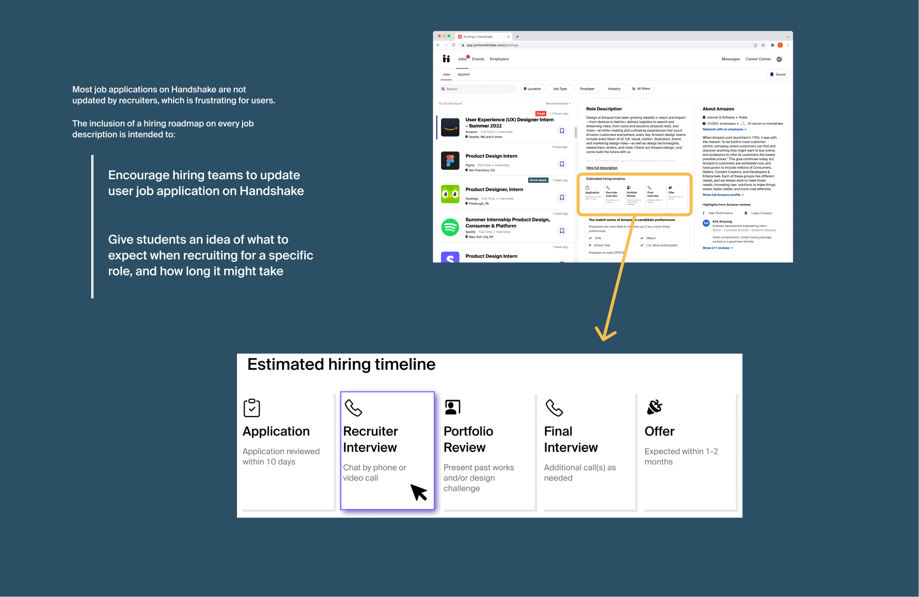
Lack of recruiting transparency, especially regarding timelines or application progress
The My Jobs section is located outside of the Jobs tab and easy to miss
Rarely updated; user relies on email notifications (if any) recruitment

3) Students are overwhelmed by the layout of the platform
“Being able to see only two or three job listings isn’t fun. Like, I want to apply, but this is hard”
Difficult to learn about potential jobs efficiently
Too much white space, text-heavy, lots of scrolling
Inefficient way to scan the page or absorb information
Adds to the stress of browsing thousands of job listings
Confusion between section names
e.g., Jobs vs My Jobs vs Saved Jobs

After my research, I honed in on a guiding question:
How might we increase the efficiency and ease of job hunting on Handshake?
IDEATION
I took my insights to FigJam and began brainstorming via various activity notes, including pros/cons, journey mapping, and more.

Persona 2

Persona 1
Based on my research, insights, and ideation, I came to the conclusion that the Jobs tab was “homebase”: AKA, where students spent the most time on Handshake. However, this tab was where students had the most pain points. I honed in on three redesign opportunities for the Jobs tab:
1) Improve the job search and filter experience
2) Increase recruitment transparency to job descriptions and applications
3) Refine the layout of the Jobs tab to decrease overwhelmingness
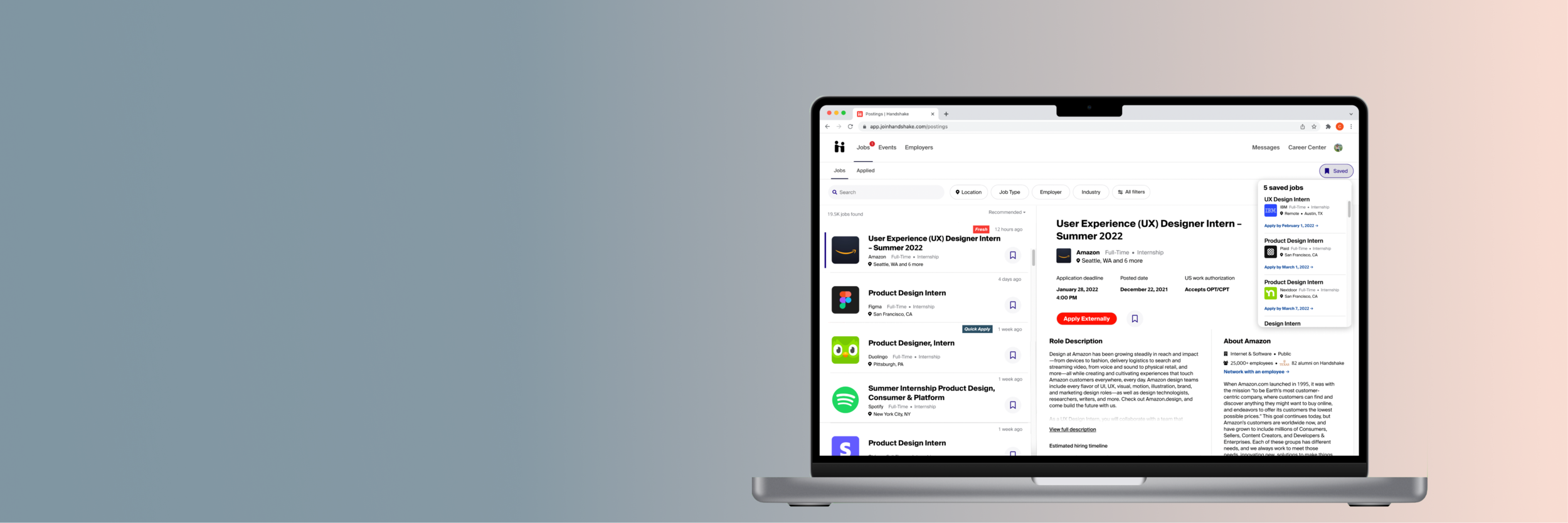
PROTOTYPE
Final design
Major redesigns

Improving job hunts via Search History + Filters bar redesign
As I aimed to increase the efficiency and ease of my users’ job search, refining the sort and filter features of the page was definite goal of mine. All Filters was overwhelmed with options, so I started off my redesigns with refining the filters bar. Based on what my interviewees valued most when considering different jobs, I decided to compile Job Types into one button in order to make room for the Employer and Industry buttons. By default, removing these will allow for a less-stuffed All Filters button, in which the user can more easily scan and select for more filter preferences.
Two of the most important redesigns regarding filter buttons include:
The addition of an “include remote work” option in the Locations Filters
The pairing of a logo with a search term in Employers
My interviewees were frustrated by Handshake’s inability to remember their searches, not just when they left the site but when they simply navigated to another Handshake page. My search log design would remember recent searches and help eliminate frustration.
To eliminate the confusion that my interviewees had over what the “Relevance” sorting meant, I replaced the term with Recommended (i.e., what Handshake thinks is the best job recommendation for you versus the most relevant job in its system).

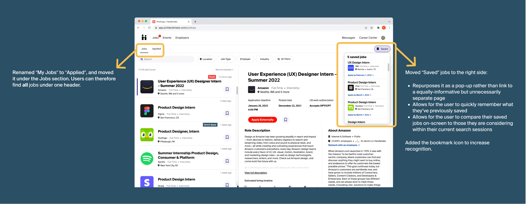
Clarifying and redefining “jobs” + adding a Saved Jobs card
In the current Handshake platform, there are three types of jobs:
Jobs = The tab where you can search, sort, and filter through job listings; the main “job hunt” page of Handshake
My Jobs = The jobs you’ve applied to, AKA Applications; can be found in the My Jobs tab under your profile menu
Saved = The job listings that you’ve saved for later while you were browsing Jobs
This generally is very confusing lingo; there is no explanation for why My Jobs is only renamed into Applications when you enter the page (or how those two are synonyms in the first place), nor why the job listings you’ve applied to aren’t located in the Jobs tab whilst your Saved jobs are.
Properly renaming My Jobs to Applied, relocating it, and then repurposing Saved was a redesign I was quick to make!
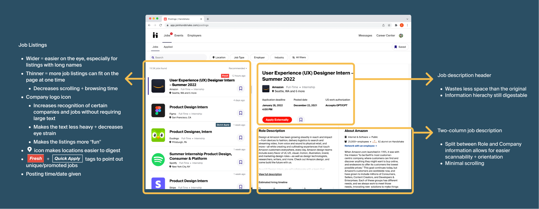
Redesigning and reorganizing Job Listing cards + Job Descriptions
The original Job Listing cards were cramped and had WAY too big of a font. This led to seemingly endless scrolls and few job listings actually viewed. The redesign incorporates wider, yet thinner cards to increase readability and quantity of listings viewed, logo icons to make listings more fun and recognizable, and more.
The major issue with the Job Descriptions were that they had too much white space, too big font, and required large amounts of scrolling to get to specific information (e.g., employee interviews listed at the bottom). The two-column redesign and smaller header allow the user to digest information quicker, and quickly get to the information that they want (potentially without scrolling at all!)
Increasing transparency by adding a hiring timeline
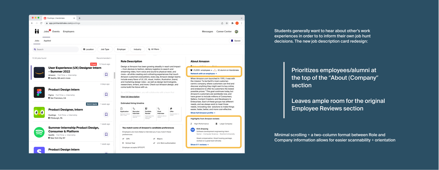
Encouraging on-platform networking
While I initially brainstormed a merging of the Jobs and Employers tab, this idea would be an overhaul of work, and would only make information more cluttered. At the core, students want to be able to efficiently find and learn about a job. Based on the research insight that students highly value being able to talk about a job/company before pursuing a specific role, I refined the Job Listings to clearly recommend an employee that a student may contact.
Handshake Job Listings currently have a “Working at (Company)” section, featuring an employee review and a link to more reviews, if available, in the Employers tab. However, this section is located at the very bottom of a job listing, which often means a user has to scroll long to find it; to note, all of my interviewees were unaware that this section existed.
If a company has not included any employees within their company Handshake page, then that is reflected in the job listing. By placing a greater emphasis on the user’s ability to connect with an employee (especially an alumnus!), this UI may actually encourage companies to include employees on Handshake, and provide a better at-work experience to achieve more positive reviews, so that more students will apply to their roles.
NEXT STEPS
My redesigns are just a starting point to improving the Handshake experience and solving the pain points of job-hunting students. A few things I’d do next include:
Conduct another round of interviews and usability tests to inform future iterations
Investigate other possible solutions, especially those for other Handshake pages that would build upon my current redesigns
E.g., Design a hiring timeline on the “Applied” page that displays the applicant’s real-time progress
CONCLUSION
I enjoyed learning more about Handshake and figuring out a way to help my college students — AKA my peers! — understand the platform. Here are a few final insights:
❤️ At the heart of any design project is the user
Design challenges aren’t just a test of hard skills! They’re for learning about and solving a problem for real users. There is no use getting caught up in the aesthetics and presentation of a design if it doesn't end up benefiting the person you're designing for! :)
💡 Understanding the mission of a brand is important to their design
Learning more about Handshake as a company was helpful to me as I envisioned the type of experience they’d want for their users. As one of those very users, I was inspired by Handshake’s mission to give all students the chance to build the career they want, no matter where they’re from or what school they attend.
As a product designer, I uphold the mission of a company in my design decisions. Delivering positive experiences for users starts with a company’s — and more specifically, employee’s — commitment to make that happen!
As a college student and Handshake user, this design challenge felt relevant + inspiring. Thank you!!